Plotting a Gaussian distribution
In previous post I wrote about mean and standard deviation. In this article I want to have some fun piloting a Gaussian distribution.
The mathematical formula of a Gaussian distribution is
\begin{equation} \label{eq:1} y(x) = \frac{1}{\sqrt{2 \pi \sigma}} \exp \left( - \frac{(x - \mu)^2}{2 \sigma^2} \right), \end{equation}where \(\mu\) is the mean of the distribution and \(\sigma\) is its standard deviation.
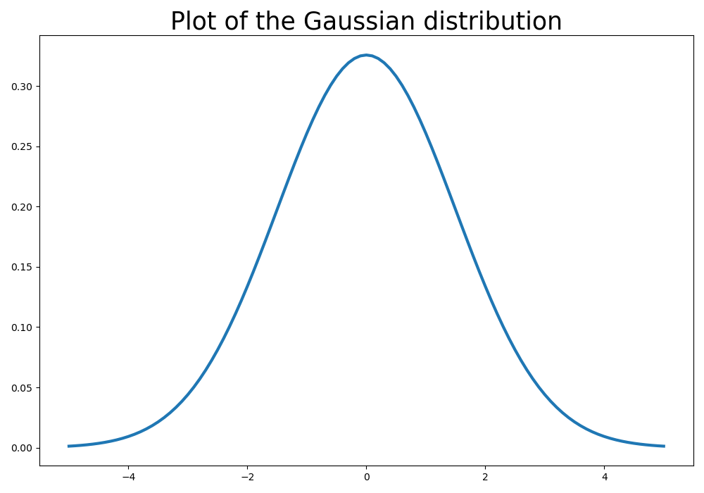
We can use numpy to build the data to be plotted.
import numpy as np
import matplotlib.pyplot as plt

mu, sigma = 0, 1.5
x = np.linspace(-5, 5, 101)
factor = np.sqrt(2 * np.pi * sigma)
y = 1/factor * np.exp(- np.square(x - mu) / 2 / np.square(sigma))

plt.figure(figsize=(10,7))
plt.title("Plot of the Gaussian distribution", fontsize=25)
plt.plot(x, y, lw=3)
plt.tight_layout()
plt.savefig(filename)
return filename
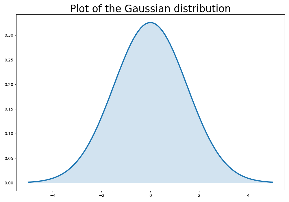
Although the plot is accurate, it is kind of boring. Let's add color filling the space between the plot and the \(x\)-axis:
import numpy as np
import matplotlib.pyplot as plt

mu, sigma = 0, 1.5
x = np.linspace(-5, 5, 101)
factor = np.sqrt(2 * np.pi * sigma)
y = 1/factor * np.exp(- np.square(x - mu) / 2 / np.square(sigma))

plt.figure(figsize=(10,7))
plt.title("Plot of the Gaussian distribution", fontsize=25)
plt.plot(x, y, lw=3)
plt.fill_between(x, y, 0, alpha=.2)
plt.tight_layout()
plt.savefig(filename)
return filename
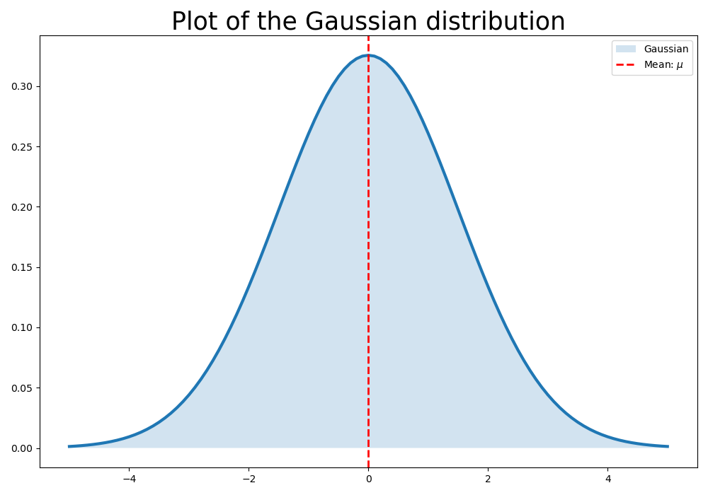
We can highlight the axis where the mean is located. For this end, I'll use the .axvline() method from the pyplot module:
import numpy as np
import matplotlib.pyplot as plt

mu, sigma = 0, 1.5
x = np.linspace(-5, 5, 101)
factor = np.sqrt(2 * np.pi * sigma)
y = 1/factor * np.exp(- np.square(x - mu) / 2 / np.square(sigma))

plt.figure(figsize=(10,7))
plt.title("Plot of the Gaussian distribution", fontsize=25)
plt.plot(x, y, lw=3)
plt.fill_between(x, y, 0, alpha=.2, label="Gaussian")
plt.axvline(x=mu, color='red', linestyle="--", lw=2, label=r"Mean: $\mu$")
plt.legend()
plt.tight_layout()
plt.savefig(filename)
return filename
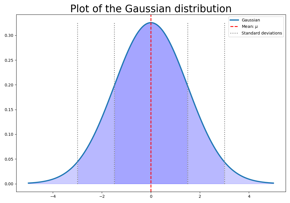
Now, Where are the lines of \(1\sigma\) and \(2\sigma\)?
The pyplot module has the method vlines, which allows to draw a series of vertical lines. I use this method to draw the lines referring to the \(1\sigma\) and \(2\sigma\) bands.
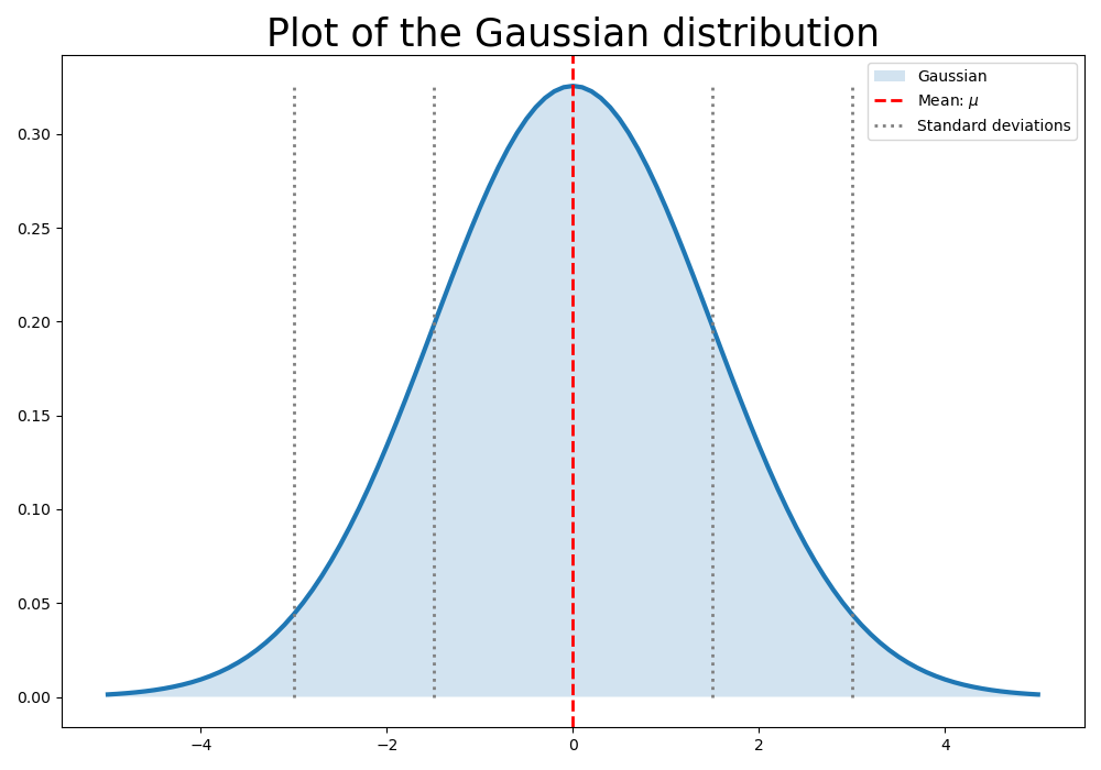
import numpy as np
import matplotlib.pyplot as plt

mu, sigma = 0, 1.5
x = np.linspace(-5, 5, 101)
factor = np.sqrt(2 * np.pi * sigma)
y = 1/factor * np.exp(- np.square(x - mu) / 2 / np.square(sigma))
sigmas = [mu-2*sigma, mu-sigma, mu+sigma, mu+2*sigma]

plt.figure(figsize=(10,7))
plt.title("Plot of the Gaussian distribution", fontsize=25)
plt.plot(x, y, lw=3)
plt.fill_between(x, y, 0, alpha=.2, label="Gaussian")
plt.axvline(x=mu, color='red', linestyle="--", lw=2, label=r"Mean: $\mu$")
plt.vlines(x=sigmas, ymin=0, ymax=np.max(y), color='gray', linestyles="dotted", lw=2, label="Standard deviations")
plt.legend()
plt.tight_layout()
plt.savefig(filename)
return filename
UPDATE 1: Using the where parameter in fill_between
The fill_between method admits a where clause, that limits the range of values to be filled.
import numpy as np
import matplotlib.pyplot as plt

mu, sigma = 0, 1.5
x = np.linspace(-5, 5, 301)
factor = np.sqrt(2 * np.pi * sigma)
y = 1/factor * np.exp(- np.square(x - mu) / 2 / np.square(sigma))
sigmas = [mu-2*sigma, mu-sigma, mu+sigma, mu+2*sigma]

plt.figure(figsize=(10,7))
plt.title("Plot of the Gaussian distribution", fontsize=25)
plt.plot(x, y, lw=3, label="Gaussian")
plt.fill_between(x, y, 0, where=(x>-2*sigma), alpha=.1, color="blue")
plt.fill_between(x, y, 0, where=(x>-sigma), alpha=.1, color="blue")
plt.fill_between(x, y, 0, where=(x<2*sigma), alpha=.1, color="blue")
plt.fill_between(x, y, 0, where=(x<sigma), alpha=.1, color="blue")
plt.axvline(x=mu, color='red', linestyle="--", lw=2, label=r"Mean: $\mu$")
plt.vlines(x=sigmas, ymin=0, ymax=np.max(y), color='gray', linestyles="dotted", lw=2, label="Standard deviations")
plt.legend()
plt.tight_layout()
plt.savefig(filename)
return filename