Visualizing the housing distribution in Chile
Continuing my exploration of the data from the chilean 2024 census, I manage to use folium to visualize the housing distribution by region.
Firstly, I needed to download a JSON file containing the geographic information of the regional geometry, regiones.json.
Now, I load a couple of columns from the parquet dataset to a pandas dataframe, and groupby region.
import pandas as pd

df = pd.read_parquet("./viv_hog_per_censo2024/viviendas_censo2024.parquet",
                     columns=["id_vivienda", "region"])

df_reg = df.groupby(['region'], as_index=False)["id_vivienda"].count()
df_reg.rename(columns={"id_vivienda": "housing"}, inplace=True)
Now, we load the regiones.json file, create a folium map, and add a Choropleth.
import json
import folium
from folium import Choropleth

with open('regiones.json', 'r', encoding='utf-8') as f:
    regions = json.load(f)

chile_center = [-35.675, -71.543]
m = folium.Map(location=chile_center, zoom_start=5, tiles='CartoDB positron')

# Create choropleth map
Choropleth(
    geo_data=regions,
    name='choropleth',
    data=df_reg,
    columns=['region', 'housing'],
    key_on='feature.properties.codregion',
    fill_color='YlOrRd',  # Yellow-Orange-Red color scheme
    fill_opacity=0.7,
    line_opacity=0.2,
    legend_name='Number of Housing Units',
    highlight=True,
    line_color='black',
    line_weight=1,
    nan_fill_color='white',
    nan_fill_opacity=0.4,
    bins=32,  # Number of bins for color classification
).add_to(m)

m
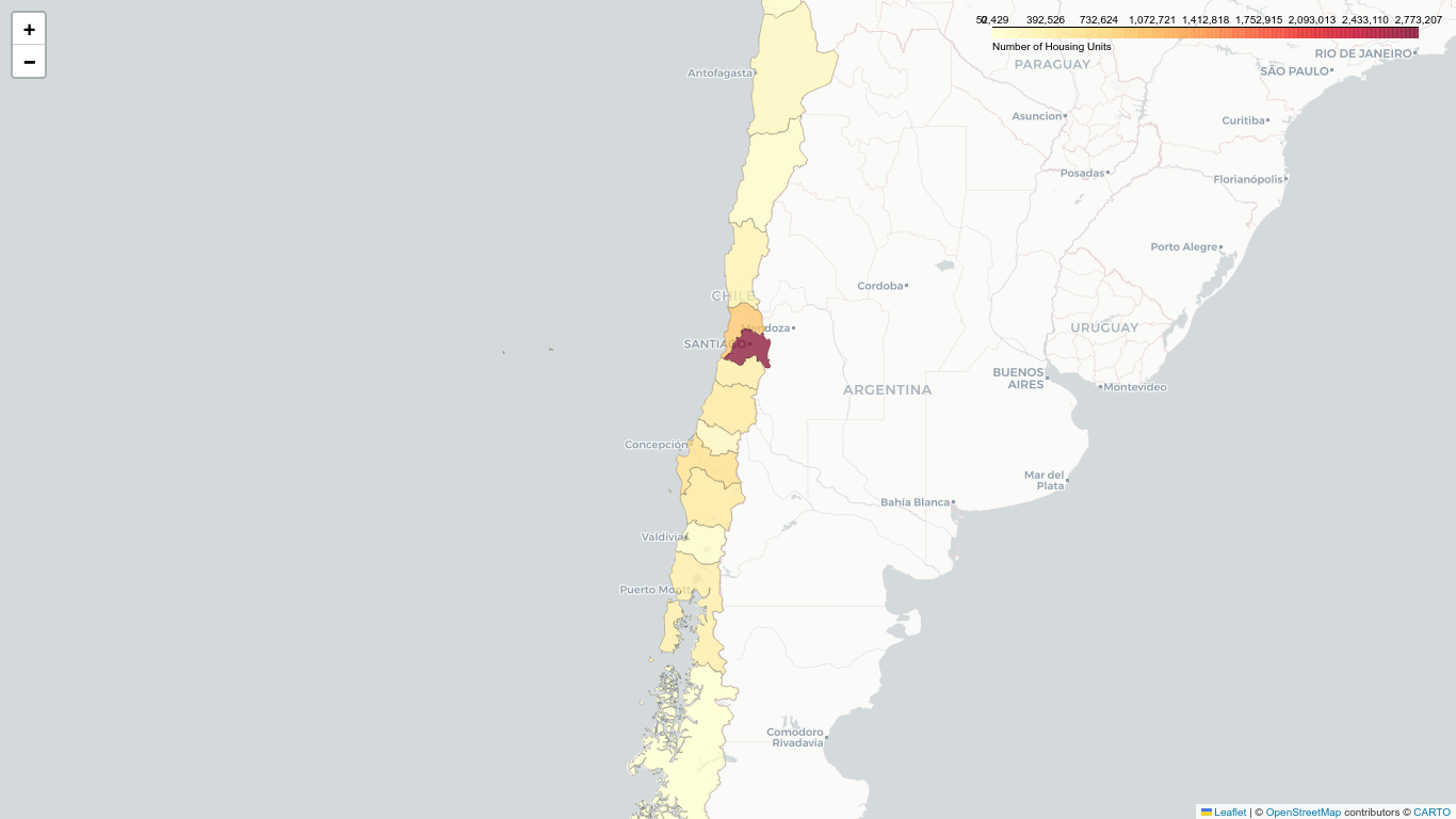
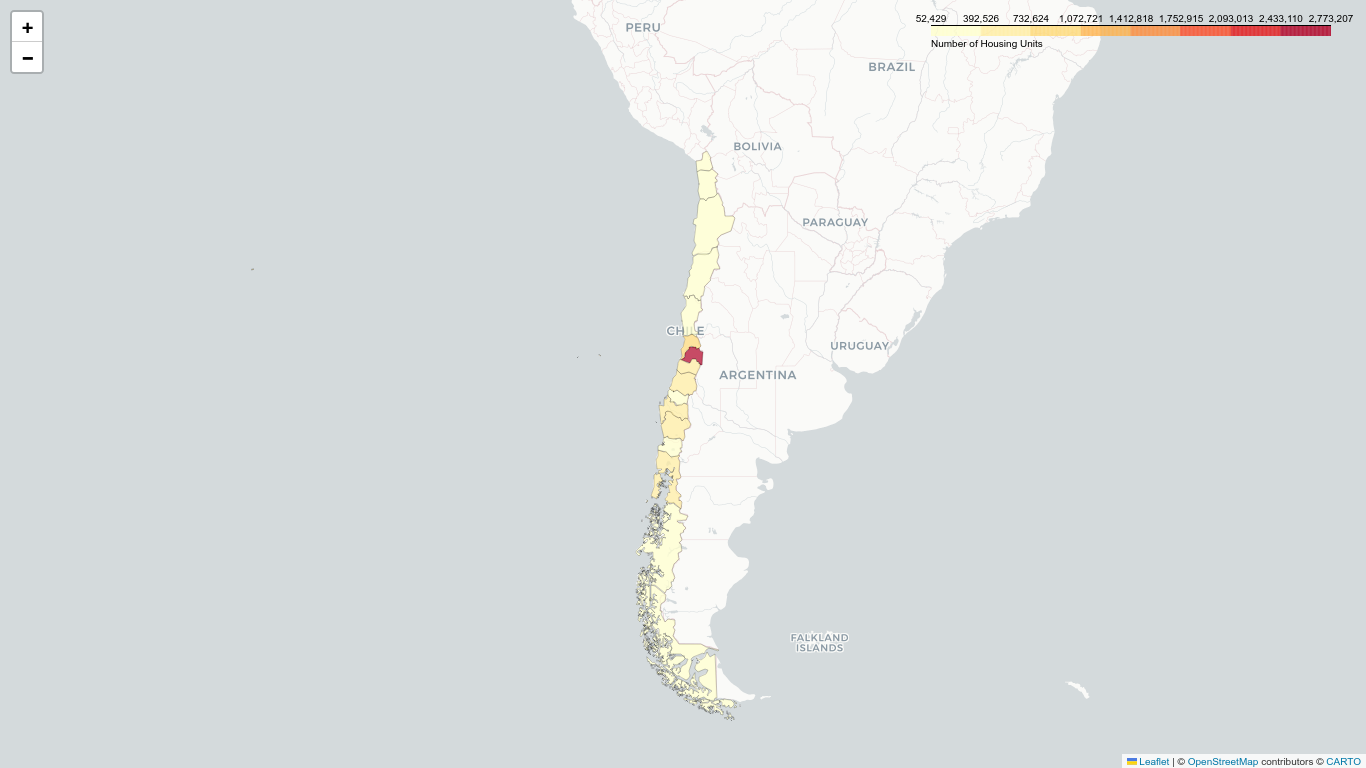
The resulting map is the following:
… or with a bit more zoom