Visualizing share prices using yfinance
yfinance is a python module that allows us to download market data through the API of Yahoo! Finance. Visit the repository.
I've been using yfinance to introduce myself to the realm of financial analysis.
You might be aware that a good practice when working with a project in python is to create a virtual environment, for not to break our operating system. I'm using uv for managing packages in this project.
After creating a directory for our project (a file in our example), we need to install both matplotlib and yfinance, using the following command line:
mkdir pyfinance
cd !$
uv init --bare
uv add matplotlib yfinance
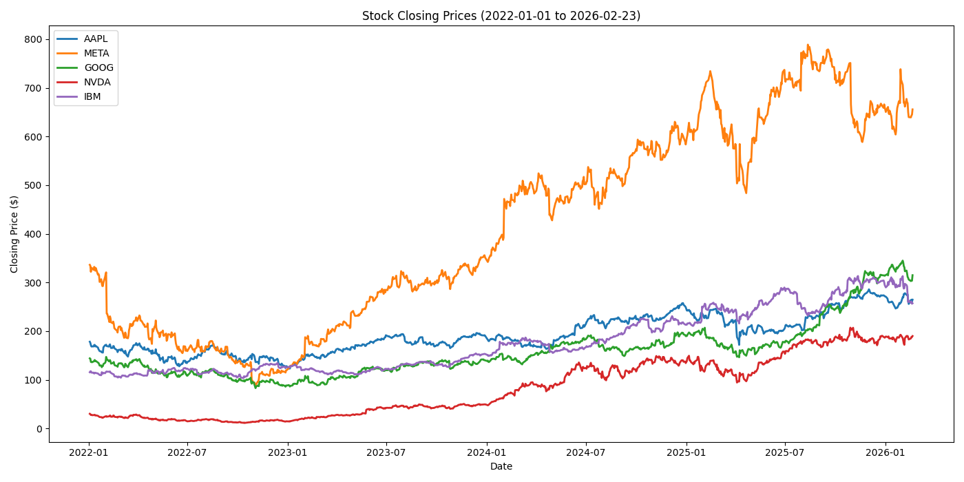
The purpose of this project would be to visualize the price of a set of market shares. The steps to achieve our goal are:
- Setting a time frame,
- Defining the set of shares of interest,
- Download the data (and explore it to understand what information contains),
- Plotting our data.
For setting out date frame, we define a start_date and end_date using datetime.datetime,
from datetime import datetime
start_date = datetime(year=2022, month=1, day=1)
end_date = datetime(year=2026, month=2, day=23)
The download method of yfinance requires a tickers argument, that is either a symbol or a list of symbols corresponding to the companies abbreviation, e.g. "AAPL" or ["NVDA", "IBM"].
The downloaded data is return as a pandas dataframe with columns named with pd.MultiIndex. These multi-indices are composed by the ticker and the characteristic (e.g. "Open", "Close", etc). We can instruct yf.download to group the data by ticker:
import yfinance as yf
from datetime import datetime

start_date = datetime(year=2022, month=1, day=1)
end_date = datetime(year=2026, month=2, day=23)
tickers = ["AAPL", "META", "GOOG", "NVDA", "IBM"]

data = yf.download(
    tickers=tickers,
    start=start_date,
    end=end_date,
    group_by=tickers
)
The last issue is the visualization in itself. I use matplotlib to create the plot. The whole code is the following:
import yfinance as yf
from datetime import datetime
import matplotlib
import matplotlib.pyplot as plt

start_date = datetime(year=2022, month=1, day=1)
end_date = datetime(year=2026, month=2, day=23)
tickers = ["AAPL", "META", "GOOG", "NVDA", "IBM"]

data = yf.download(
    tickers=tickers,
    start=start_date,
    end=end_date,
    group_by=tickers
)

plt.figure(figsize=(14, 7))
matplotlib.use("Agg")
for ticker in tickers:
    plt.plot(
        data[ticker]["Close"],
        label=ticker,
        lw=2
    )
plt.title(
    f"Stock Closing Prices ("
    f"{start_date.strftime('%Y-%m-%d')} "
    f"to {end_date.strftime('%Y-%m-%d')})"
)
plt.xlabel("Date")
plt.ylabel("Closing Price ($)")
plt.legend()
plt.tight_layout()
plt.savefig("./multi-data-plot.png")