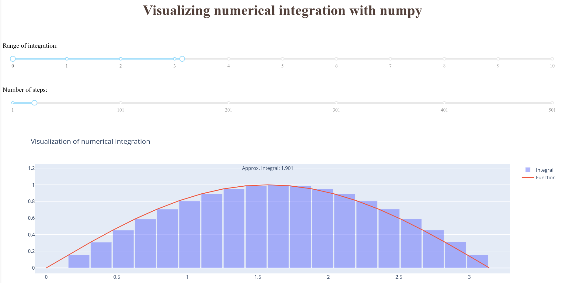
Visualizing the numerical integration with dash

Yesterday I share the a simple numerical method to calculate an approximate value of the integral of a function (see the post). Today I bring you a simple dashboard built using dash.
Without further introductions, the code
import numpy as np
import dash
from dash import dcc, html
from dash.dependencies import Input, Output
import plotly.graph_objects as go

a, b = 0, 2


app = dash.Dash(__name__)
app.title = "Visualizing numerical integration with numpy"

app.layout = html.Div(children=[
    html.H1("Visualizing numerical integration with numpy",
            style={
                'textAlign': 'center',
                'color': '#503D36',
                'font-size': 35}),
    html.Br(),
    html.P("Range of integration:"),
    dcc.RangeSlider(
        id="integration-range",
        min=0, max=10, step=0.01,
        marks={i: str(i) for i in range(0, 11)},
        value=[a, b]
    ),
    html.Br(),
    html.P("Number of steps:"),
    dcc.Slider(
        id="number-steps",
        min=1, max=501, step=10,
        marks={i: str(i) for i in range(1, 1_000, 100)},
        value=10
    ),
    html.Br(),
    html.Div(dcc.Graph(id="visualization-chart")),
])


@app.callback(
    Output(
        component_id="visualization-chart",
        component_property="figure"
    ),
    [
        Input(
            component_id="integration-range",
            component_property="value"
        ),
        Input(
            component_id="number-steps",
            component_property="value"
        )
    ]
)
def get_plot(integration_range, num_steps):
    a, b = integration_range
    steps = num_steps
    dx = (b - a) / steps
    x = np.linspace(a, b, steps)
    y = np.sin(x)
    result = y.sum() * dx

    fig = go.Figure()
    fig.add_trace(
        go.Bar(
            x=x,
            y=y,
            width=dx,
            offset=0,
            opacity=0.5,
            name="Integral")
    )
    fig.add_trace(
        go.Scatter(
            x=x,
            y=y,
            mode="lines",
            name="Function")
    )
    fig.add_annotation(
        x=(b-a)/2,
        y=1.2,
        text=f"Approx. Integral: {result:.3f}",
        showarrow=False,
        align="left",
    )
    fig.update_layout(
        title_text="Visualization of numerical integration"
    )
    return fig


if __name__ == "__main__":
    app.run()
With an example of the output: